Colour isn’t just decoration – it changes how a room feels, how big it looks, and even how you behave in it. In decorative painting, colour is a design tool: it can energise, calm, warm, cool, expand or cocoon a space. Colour Theory
Start with the colour wheel (it’s the cheat code)
The colour wheel helps you predict what colours will do together – calm, clash, or create contrast. Primary, secondary and tertiary colours aren’t just art class trivia; they’re the foundation for every palette you’ll ever choose. Colour Theory
Pick a harmony that matches the mood
If you want an easy win, choose one of these harmony “recipes”:
- Analogous (neighbours on the wheel) for calm, blended spaces Colour Theory
- Complementary (opposites) for bold, high contrast feature moments Colour Theory
- Split complementary for contrast that feels less intense Colour Theory
- Triadic for balanced, lively colour energy Colour Theory
Warm vs cool: the simplest decision that changes everything
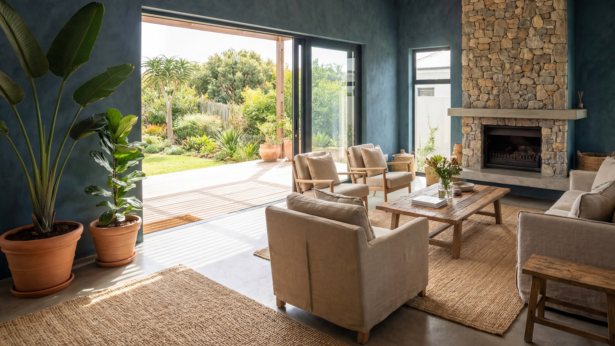
Warm colours (reds, oranges, yellows) bring energy and cosiness. Cool colours (blues, greens, purples) feel calmer and more spacious. That’s why warm tones often suit social zones, while cool tones shine in bedrooms and quiet spaces. Colour Theory
Why paint looks different on the wall than on the card
Paint colour is literally light physics: pigments absorb some wavelengths and reflect others. Finish also matters – matt scatters light more softly, gloss bounces it back and intensifies colour. Lighting conditions can shift a colour dramatically. Colour Theory
And yes, metamerism is real: the same colour can look different under different lights. Colour Theory
A practical rule that never fails: 60-30-10
If you want a balanced room without overthinking it:
- 60% dominant colour (usually walls)
- 30% secondary colour (furniture, curtains)
- 10% accent colour (art, décor, feature moments) Colour Theory
The biggest mistakes (and how to avoid them)
- Not testing colour in different lighting Colour Theory
- Going too bold everywhere (feature moments work better than full saturation) Colour Theory
- Ignoring undertones (that’s where “why does this look wrong?” comes from) Colour Theory
Takeaway: Choose a harmony, respect light, and keep your palette roles clear. That’s how colour starts looking intentional.